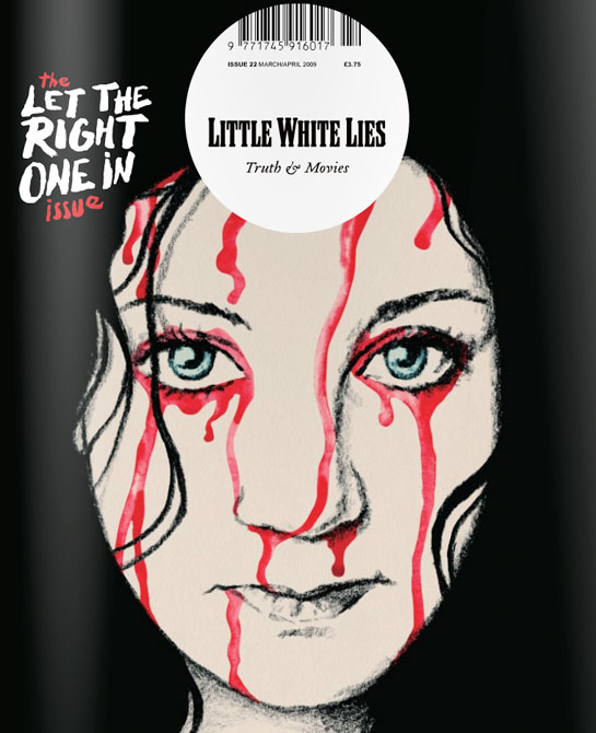
This is a strange film magazine that caught my attention. It defies many conventions of the everyday music magazine.
- It lacks in cover lines around the side to show what else is in the magazine, we just see one film shown on the front with no other indication of what is inside.
- The barcode is central to the magazine at the top when it is usually hidden away at the side in the corners.
- The masthead Is not the biggest text on the page, in fact smaller than the coverline for the main story and it is not at the top, but central and inside a circle.
- The image is shown central, almost a hand drawn image not a photograph.
- The larger coverline shows importance of this story and as it is the specific issue for it, it is key. It almost seems as though the magazine does not want the attention due to the small masthead, but in fact they want to give all their attention to the movie. This may make it more of a people's choice.
- It still has a slogan or tagline under the masthead, this reads 'truth and movies' this is in stark contrast with the title 'little white lies' it creates an enigma. Which do we believe? The magazine is already mysterious as we have next to no idea what will be inside and now this.
- The tagline is written in a cursive writing, this is classy and sophisticated and in itself, old fashioned.
- The font of the masthead is retro, the entire magazine doesn't look so modern as other magazines in the genre. This emphasised by a hand drawn image. Again, it is niche and different with the main coverline font looking hand written too, like the technology other magazines used isn't here. It's more old fashioned.
- The image is the main focal point, the art. It is central with colours that juxtapose the background (the pale white skin on the black background with the bright red in contrast) It's not difficult to believe that someone may buy the magazine just for the art on the front, to keep it. It acts as a unique selling point.
- The pale white skin not only contrasts with the background but makes it seem more eerie, when someone is scared they often go pale.
- However, the expression of the person in the image itself is straight faced, calm and indifferent. This contrasts greatly with the blood that coats her. Is she used to it? Does she want it?
- The red we know as blood and due to it being the mainly colourful thing, our eyes are drawn to it. Some of the text is red too and as it is handwritten, it looks as though it is written in blood which is even scarier.
- The image is a close up, we see direct address big eyes and untarnished skin. This all makes her seem young, pure and innocent.

