Monday, 9 December 2013

Wednesday, 27 November 2013
Fonts

These are some of the fonts I was interested in using for the main text on my movie poster for the film. I found them all on dafont.com and downloaded them for use, no default Microsoft fonts.
I liked the first because of the effect of it looking like it was smudge, as though it could have been written with something such as blood. This is obviously linked to the horror genre in many ways, the use of blood as writing often used for a warning for the characters. It also links into my trailer with the use of the blood writing which says 'No exit'. I found however that it was too small but long, when it was resized it seemed out of proportion.
The second I liked for similar reasons but I found that the wide letters seemed almost too comedic, like it has been done for ease of reading and makes it feel somewhat too easy for a horror genre, the letters were also too long and large for the poster.
The third is what I decided to use. This I found could be interpreted in many ways, it can look as though it was smudged in blood or something wet and at the same time creates a static effect, as though something has been jumping around and it has blurred, linking to some of the quick paces in my movie, the jumpy aspects of it and gives a more haunting feel with the motion lines, like a spector moving disjointedly.
The fourth I liked for similar reasons however this did not support the use of punctuation, unfortunately as my title contains a question mark this would not have worked.
Wednesday, 20 November 2013
Original Pictures- before manipulation

 These are some of the pictures that I took when trying to create the ones for my film poster. I decided on the idea of an eye as it is key to the character of the villain as the man thing in looks that seperates her from the girl that she is possessing is the change in the eye colour and blood that surrounds it. I also wanted to do it as half the face because this can connote a sense of a split personality, we are only seeing this side of them. As she is possessing someone, I wanted to be able to show that this is not completely them. There is two sides to this person and we are only seeing one so we are left wondering about the other, it creates an enigma. I wanted the expression to be more or less emotionless, stone cold. It creates a less human view on the character then and the direct address can be even more daunting as she seems to be staring right at the viewer. I wanted pale skin to be able to contrast with the blood.

 As I progressed I found that the blood on the cheek could hinder what I put on the poster, text wise. It seemed too similar to my front cover and too cluttered. Instead I found that I come up with a different idea for my poster, I would add the blood separately and in a less obvious way, more cutting through the eye. I also wanted the expression to change slightly too, to seem more menacing and I found that the hiked brow does this well.
Thursday, 14 November 2013

Friday, 8 November 2013
Recreation of magazine


These show the recreations of a Little White Lies magazine front cover that I have done made from the photo in the centre. I used the almost abstract, artistic editing style to posterise it and a convention of Little White Lies is to have a portrait of the character on the front so I wanted to test out the use of the portrait and the best way to edit it. I made the face paler and background darker to add more of a contrast using the brightness and contrast enhancer whilst using and experimenting with filters on Photoshop to see which filters made the best look for the front cover of these magazine.
I had more problems with the font after being unable to download them once more so I had to use the default fonts that come with Photoshop which I am not very happy with but I was experimenting with where I could put the text itself and went for a daring practice of putting it actually on top of the image and found that I rather liked it as it filled some of the dark and empty space.
Thursday, 7 November 2013
Poster recreation
These pictures show the recreation of the film poster that I produced. I chose this poster as I am interested in doing an eye for my main poster as it is important part of the identity of the villain. The first image shows the image I took in order to recreate the image on the right hand side. I noticed that there was many problems with the image that I took. The pupil is facing the wrong direction, the eye colour is blue and not brown, the lighting has not got a high enough contrast.
In order to remedy these problems I edited it in Photoshop. I had to cut out the iris and pupil and move it to the right and then cover up the whites of the eyes. I had to use the paint tool in many instances, filling in where the colours needed to be changed and then adjusting the opacity. Often these brushes mnad the image too soft so I had to adjust the sharpness whilst also adjusting the contrast and saturation to ensure that the colours were even more acurate.
I did have a problem with the font, unable to download any so I could not try and recreate the image completely on photoshop so in order to remedy this I copied the text from the origional poster and added it to mine.


Storyboard
I wanted as little dialogue as possible so that there was not too much to take in for the viewers whilst they are watching, just enough that there is an understanding of some of the characters and the situation they are in but not too much that it is forgettable.
Script:
Clara when sitting up from the sofa, talking about Ivy and Casey:You two are making me sick, I'm getting a drink.
Clara: (lights go out) Hey, where did the lights go.
Casey whilst talking about the ouija board: I have an idea.
Ben: (Sounding unsure) Are you guys sure about this?
Casey: What, are you scared?
Ivy: Is anybody there?
At the end of the trailer, Clara: I'm missing 90210 for this you witch!
Sunday, 27 October 2013

Friday, 25 October 2013
Thursday, 24 October 2013
Wednesday, 23 October 2013
Tuesday, 15 October 2013
Horror Sound Board
This is an example of a practice soundscape that I made that included some examples of sound effects that I may use in my final trailer. It includes a lot of affects that can be used to change the atmosphere and the ambiance. I also wanted to try and convey a story using just sound, in this case a kind of journey that comes to an abrupt and potentially fatal end. I tried to convey this in many ways, setting a scene for example, the water dripping can make it feel hollow and quiet. It must be quiet, unsettlingly so if you can even hear small water droplets and even a clock ticking. It also connotes that it made be a rundown place there, old and unloved. The weather is rough, wintery and you know that it will be dark and frightening if there is the involvement of a thunderstorm which connotes the opposite of calm as do the frantic dog barking. The footsteps lead us to follow this person in a pathway, it creates a kind of flow to the story, a journey. The dial tone and failure to call someone also can create a sense of disturbance, unsettling that they are not there and a feeling of iscolation. There is no one you can contact. After that it picks up, a turning point in the story and the music leads us to a chattering room, seemingly normal until there is an abrupt end which leads us to ask questions as to what happened, who in this gathering of people is hurt.
Thursday, 10 October 2013
Settings 1
These images are all taken from my school. The school is large and I find that the neatness and white walls with long, repetitive corridors could be comparable to that of a hospital or asylum. The place itself holds a lot of symmetry and blank, light walls with space to shoot at.
The first image is of a stairway, this shows what perfect symmetry can be created here with the empty and open stairways that are good for a running/following scene.
I have edited each image in a way to make them more appealing and relevant to this genre. The first image has a higher contrast. This can make the whites of the walls stand out which can make it seem more sterile, more like a hospital/asylum. The high contrast also makes the shadows stand out more which can make it feel more eerie and mysterious.
The high angle makes the stairs look even longer, like it would be more of a struggle to climb.
The second image shows the use of framing. It shows the use of one of the corridors whilst we use the framing of the window. This makes us feel like an outsider looking in and again, uses symmetry to make things eerily neat and sterile.
The next two images again show the hallways that seem almost endless and white but also how colour can create an emotional response when they are paired.
The first one shows warmer colours, oranges and browns that make us feel more warm and comforted. The second uses more blues which feels so much colder and makes the white stand out even more. This can increase the sterile feel and unsettling chill from the blank, emotionless, bare colours.
The next image shows the hallways again but how shadows can be used for effect too. The colours are warmer but this helps us to notice the difference in darkness. The hallway seems to gradient until the walls are dark and we see silhouettes. This can be used for a mysterious effect especially as you can not see people's expressions which seems to dehumanise them.
The next shows some of the colour of the place itself. The grey/black walls that seem bare and prison like and the trees are eerily white and thin, bare which we associate with winter, coldness, abandonment and death.
The next pair show the use of lines in the work. It can give a sense of being trapped, again of prison but also of a lack of escape, separation from the outside world and being like no more than a caged animal. Looking from the inside out and not being able to change that.
The next show how saturation can effect it. The second of the two images is more vibrant in colour, this seems to add more of a warning from the sign but is less dark and frightening than the first which seems colder and more moody and grim.
The location also has an abundance of signs. Ones about no exits, off limits and where the exits are for people to leave.
The next picture shows a door with no sign, this itself adds mystery of what might be in that room and gives us an opportunity to use it for our own purposes.
The following then shows another long hallway but this one is a dead end, this again leads to the feeling of no escape and if being chased, being inevitably caught.
The final three show some broader shots of the place. Empty classrooms for us to use and the emptiness is spook as it can seem abandoned. The building itself is large and grey and almost prison like whilst there are dark colours used throughout and still the ability for highschool elements that we see can easily be shot from above.
Tuesday, 8 October 2013
Proposal
I am aiming to complete a film trailer, poster and magazine front cover for an up and coming supernatural horror film that I am designing.
I am aiming to complete this task in a sequence with a plan that I have devised (seen on my Gantt chart) I have careful timing to ensure that the right work goes into the design of the film. The Gantt chart provides me with a twenty week plan to ensure that I meet deadlines and manage the time well.
I aim to use as many different types of technology as possible to ensure that I have the widest use of digital technology possible and that I, in turn understand more about the technology that can be used within the film, helping to broaden my use of online software. This will be valuable skills when it comes to the editing of my film and photo graphs.
I plan to use Garage band and Imovie for this especially so within my planning I have incorporated tasks that will ensure that my understanding of them improves so that I am even more advanced with it when the time comes to use them on my final piece.
The genre of my film will be a supernatural horror. I find that this can be a good film for the audience that I plan at a 15 age rating for around 15 year old adolescents to early twenties young adults. I think that this is a good audience as the pace can be fast without being too gory or psychological, keeping a theme of mystery. I aim to appeal to them with the use of a young cast, a group of very different teenagers that are forced to use teamwork. These may be ideals that this audience can relate to. They may be of around this age, be forced to overcome differences. Whilst being a thrilling horror, it can be relatable.
I feel it may more appeal to girls as it is a heavily female cast. I found that this was a good idea as very often in horror films there is a larger number of men, Alpha males that take charge and are the hero. In this case, it's the Alpha women in charge and I feel that this should be something more expressed.
There is also a homosexual relationship in it which may therefor appeal to members of the LGBT community as this is something not so easily expressed in a film where it is not the main focus of the story/source of conflict.
As a classification, I believe that the film is likely to be classed as a 15. I have decided on this because looking at films of a similar genre such as Insidious, Paranormal Activity and Cabin in the Woods, they all have similar qualities to the idea I have in mind and are rated to this classification. My film is likely to contain less emphasis on blood and gore and more about the unknown and mysteries. What is and what isn't real.
I decided that the name of my film would be 'Is Anybody There?' I decided this because it first acts as an enigma as it is a question, it leads the audience to want to know the answer to the question. It speaks as though it is addressing the audience or involving them in the film. Also, this is a common thing asked when it comes to contacting the dead or partaking in a séance or Ouija board so it links to an idea of what the film will be about without giving too much away, still creating an air of mystery.
Friday, 4 October 2013
Scene pick out
This shows the picking out of scenes that I did of a teaser trailer for the film Shutter Island. It gives me an idea of how long the duration of each scene is, the type of angles used and such for when I plan my own movie trailer.
BBFC
Examples of movies within each age classification:
Universal: Monster's Inc.
PG: Night at the Museum
12: Pirates of the Caribbean, Woman in Black
15: Cabin in the Woods, Conjuring
18: Hostel, Scream
I am interested in doing a film similar to Cabin in the Woods and Conjuring with the teenage aspect of the former and supernatural of the latter. In comparison, a 15 grade might be best for my film.


Tuesday, 1 October 2013


Deconstruction of film poster

- Quote from respective source reinforces how relevant and trustworthy the quote actually is.
- Important words in the quote are bolder for emphasis. Words that stress on how scary the film is to reinforce how much so it is, saving the viewer from reading too much that isn't important.
- The font from the trailer Is reused to add recognisability.
- The eyes of the child are strange, eyes are an important part to create a relationship or a feeling of emotion and yet they are blocked which is even more unsettling. Where the mode of address is direct, it's almost like he is hypnotising us.
- The eyes are covered with white which stands out stark against the black background and emphasises on them. They become a focal point and right in the centre of the page, it really brings your attention to them and as they are scary, it really adds to the horror aspect.
- The house in the background looks like a common one in suburban USA, a family house but the windows are dark, you can't see in while the outside is light. It creates a mystery as to what is inside the house.
- There is a viegnette affet whih makes it feel the like darkness is creeping in from around the edges of the image and this emphasises his eyes even more. It also brings attention to his face as a whole, framing the child. He is important, he is alone on the page, central and with direct address. We know he is key. The shot type is a close up of him, it really foces on his face and expression.
- Even stranger about his expression, he lacks one. His face seems vacant and the lack of eyes really supports this. He is not snarling or looking threatening to the viewer but that a lot feels worse. He is blank and as a result, we have no idea what this important child is thinking, planning. What part he plays.
- The lighting on him is high contrast, we see large highlights and low lights. It creates and almost ethereal look to him especially against a more flat background. It seems more spooky.
- There appears to be a shadow in the window of the house over the boy's shoulder in a room upstairs which we presume then to be a bedroom. We then assume to what the actual plot is. I the child is the horrific being or whatever is in the window. It leads us to be curious of the plot and ask more questions.
Friday, 6 September 2013
Film Magazine Deconstruction
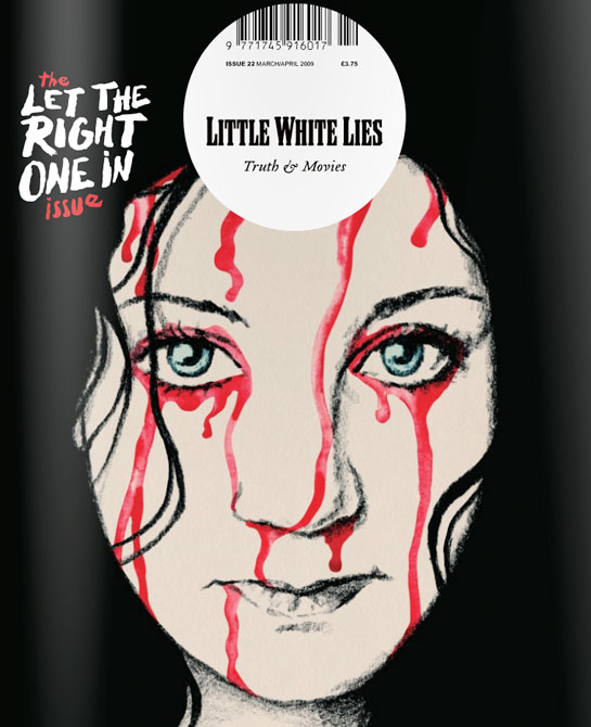
This is a strange film magazine that caught my attention. It defies many conventions of the everyday music magazine.
- It lacks in cover lines around the side to show what else is in the magazine, we just see one film shown on the front with no other indication of what is inside.
- The barcode is central to the magazine at the top when it is usually hidden away at the side in the corners.
- The masthead Is not the biggest text on the page, in fact smaller than the coverline for the main story and it is not at the top, but central and inside a circle.
- The image is shown central, almost a hand drawn image not a photograph.
- The larger coverline shows importance of this story and as it is the specific issue for it, it is key. It almost seems as though the magazine does not want the attention due to the small masthead, but in fact they want to give all their attention to the movie. This may make it more of a people's choice.
- It still has a slogan or tagline under the masthead, this reads 'truth and movies' this is in stark contrast with the title 'little white lies' it creates an enigma. Which do we believe? The magazine is already mysterious as we have next to no idea what will be inside and now this.
- The tagline is written in a cursive writing, this is classy and sophisticated and in itself, old fashioned.
- The font of the masthead is retro, the entire magazine doesn't look so modern as other magazines in the genre. This emphasised by a hand drawn image. Again, it is niche and different with the main coverline font looking hand written too, like the technology other magazines used isn't here. It's more old fashioned.
- The image is the main focal point, the art. It is central with colours that juxtapose the background (the pale white skin on the black background with the bright red in contrast) It's not difficult to believe that someone may buy the magazine just for the art on the front, to keep it. It acts as a unique selling point.
- The pale white skin not only contrasts with the background but makes it seem more eerie, when someone is scared they often go pale.
- However, the expression of the person in the image itself is straight faced, calm and indifferent. This contrasts greatly with the blood that coats her. Is she used to it? Does she want it?
- The red we know as blood and due to it being the mainly colourful thing, our eyes are drawn to it. Some of the text is red too and as it is handwritten, it looks as though it is written in blood which is even scarier.
- The image is a close up, we see direct address big eyes and untarnished skin. This all makes her seem young, pure and innocent.


Film Trailer Deconstruction
Insidious
is a supernatural horror film, I am interested in doing this genre as
my final film. On interesting point on this is the whole trailer is
deemed a flashback, this is a strange part of temporal editing. It shows an unamed,
unknown man to us in some kind of therapy session or hypnosis as though
to try and recall a repressed or horrific memory. This starts by giving
us an insight into how horrifying this film and the situation and film
will be.
We
see the words 'Insidious is Insidious' repeated over and over among the
clip. Each time it gets closer to us, this creates a feeling of
suspense, of an impending thing to come, it helps the pace because as it
gets closer, it builds us up for something to come, for what happens
when the word reaches us. It gets faster, the letters jumble
as though in a panic and it acts as a raise of our pulse. Between it
there are more cuts, faster. It shows a lot of clips in one sequence, a
montage of fast jump cuts that get faster with the speeding up of the
words on screen. The montages get shorter too, everything seems to lead
to some sort of conclusion.
The sound is also important pace wise as we actually
see a metronome at the beginning which is an item use to keep the pace
of music. We then see the jump cuts move in time with the beats of the
metronome as it gets louder, it becomes more and more dramatic. It again
leads us up to something. There is a silence so exaggerated between each
beat as well which is just eerie. And then the beat is so pointed and
deep when it comes, it disrupts the silence and we expect it. There is
also cliché noises exaggerated, creaking of doors an floorboards that we
expect from a horror film. A conventional part.
We
begin with being shown a happy house, we get a pan of their family home
which looks idealistic. A large garden, no cliché looking haunted house
like we might expect. We here the term 'Sweetie' used which is a fond
word, it shows there is love in the family, caring. They laugh and lift
their baby, clearly so pleased to have him. It's perfect family
atmosphere. But the metronome keeps ticking, counting down. We know
something is going to mess it up. And then the child falls, the rushed
words are back on screen and the happy, family montage leaves and we know something bad has happened, this event is key, it even shows it in a close up so that we really see the importance of the event it is an iscolated clip and we don't miss the importance. We then see the clip of him in a coma, this acts as a kind of spatial editing, a cause and effect. The fall leads to a coma.
We see him in a coma over the parent's shoulders as if we are stood
with him, visiting him. We get an idea of what it's like as their family
member. We empathise. It get's us emotionally involved.
A
lot of the shots are through hallways of the house, we follow them
through it. The shots are travelling, we move with the camera like in a
dolly shot, we are with them all the time. We don't feel like an
outsider. We are part of it. That is even more unsettling.
Voice overs are used a lot, paired with important scenes. It helps to clary what is happening. The 'there's something in
Dalton's room' paired with an image of his room gives us an idea of the
plot without giving to much away. It remains vague and leads us to
asking questions. What is in his room? It's all make the suspense
increase.
Shutter Island Recreation
Analysis of this work:
This was a piece of work I did in preparation for the real trailer. As opposed to doing a practice film, I felt that an experimental film trailer made more sense and would be more relevant for me in the future of this project thus helping me out a little more.
I remade the Shutter Island teaser trailer. I chose this film because it is of a similar genre I had considered doing. A psychological horror. On reflection however, I have decided against the psychological aspects as it can involve various difficult locations and a large cast. It steered me towards the choice of a supernatural horror. Creating this film trailer helped me to decide this in a trial and error bases.
If found that it improved my understanding of IMovie to edit films and such on Mac computers. I before hadn't known how to change the colour of the scenes to create a different feel and as lighting was difficult having only filmed at school, it helped me to edit the lighting post production.
It also helped me to get a greater understanding of how to decide locations and work with actors. I realise that I need to manage a fairly large team and in ways that will suit everyone which this gave me a taster of how to do.
It also helped me to understand other things with the planning of the movie. I had to create story boards and such in order to plan it and I had never done this before. I found it helped me greatly in breaking down the elements I needed to include.
However, there were some things that I found were difficult to accomplish. This came in the form of sound and voice. It was difficult to record high quality sound and voice overs that matched the scenes so this will be something I shall have to practice to do in the future.
Subscribe to:
Posts (Atom)