
Showing posts with label deconstruction. Show all posts
Showing posts with label deconstruction. Show all posts
Tuesday, 1 October 2013

Deconstruction of film poster

- Quote from respective source reinforces how relevant and trustworthy the quote actually is.
- Important words in the quote are bolder for emphasis. Words that stress on how scary the film is to reinforce how much so it is, saving the viewer from reading too much that isn't important.
- The font from the trailer Is reused to add recognisability.
- The eyes of the child are strange, eyes are an important part to create a relationship or a feeling of emotion and yet they are blocked which is even more unsettling. Where the mode of address is direct, it's almost like he is hypnotising us.
- The eyes are covered with white which stands out stark against the black background and emphasises on them. They become a focal point and right in the centre of the page, it really brings your attention to them and as they are scary, it really adds to the horror aspect.
- The house in the background looks like a common one in suburban USA, a family house but the windows are dark, you can't see in while the outside is light. It creates a mystery as to what is inside the house.
- There is a viegnette affet whih makes it feel the like darkness is creeping in from around the edges of the image and this emphasises his eyes even more. It also brings attention to his face as a whole, framing the child. He is important, he is alone on the page, central and with direct address. We know he is key. The shot type is a close up of him, it really foces on his face and expression.
- Even stranger about his expression, he lacks one. His face seems vacant and the lack of eyes really supports this. He is not snarling or looking threatening to the viewer but that a lot feels worse. He is blank and as a result, we have no idea what this important child is thinking, planning. What part he plays.
- The lighting on him is high contrast, we see large highlights and low lights. It creates and almost ethereal look to him especially against a more flat background. It seems more spooky.
- There appears to be a shadow in the window of the house over the boy's shoulder in a room upstairs which we presume then to be a bedroom. We then assume to what the actual plot is. I the child is the horrific being or whatever is in the window. It leads us to be curious of the plot and ask more questions.
Friday, 6 September 2013
Film Magazine Deconstruction
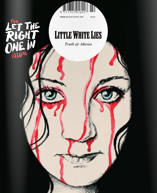
This is a strange film magazine that caught my attention. It defies many conventions of the everyday music magazine.
- It lacks in cover lines around the side to show what else is in the magazine, we just see one film shown on the front with no other indication of what is inside.
- The barcode is central to the magazine at the top when it is usually hidden away at the side in the corners.
- The masthead Is not the biggest text on the page, in fact smaller than the coverline for the main story and it is not at the top, but central and inside a circle.
- The image is shown central, almost a hand drawn image not a photograph.
- The larger coverline shows importance of this story and as it is the specific issue for it, it is key. It almost seems as though the magazine does not want the attention due to the small masthead, but in fact they want to give all their attention to the movie. This may make it more of a people's choice.
- It still has a slogan or tagline under the masthead, this reads 'truth and movies' this is in stark contrast with the title 'little white lies' it creates an enigma. Which do we believe? The magazine is already mysterious as we have next to no idea what will be inside and now this.
- The tagline is written in a cursive writing, this is classy and sophisticated and in itself, old fashioned.
- The font of the masthead is retro, the entire magazine doesn't look so modern as other magazines in the genre. This emphasised by a hand drawn image. Again, it is niche and different with the main coverline font looking hand written too, like the technology other magazines used isn't here. It's more old fashioned.
- The image is the main focal point, the art. It is central with colours that juxtapose the background (the pale white skin on the black background with the bright red in contrast) It's not difficult to believe that someone may buy the magazine just for the art on the front, to keep it. It acts as a unique selling point.
- The pale white skin not only contrasts with the background but makes it seem more eerie, when someone is scared they often go pale.
- However, the expression of the person in the image itself is straight faced, calm and indifferent. This contrasts greatly with the blood that coats her. Is she used to it? Does she want it?
- The red we know as blood and due to it being the mainly colourful thing, our eyes are drawn to it. Some of the text is red too and as it is handwritten, it looks as though it is written in blood which is even scarier.
- The image is a close up, we see direct address big eyes and untarnished skin. This all makes her seem young, pure and innocent.

Film Trailer Deconstruction
Insidious
is a supernatural horror film, I am interested in doing this genre as
my final film. On interesting point on this is the whole trailer is
deemed a flashback, this is a strange part of temporal editing. It shows an unamed,
unknown man to us in some kind of therapy session or hypnosis as though
to try and recall a repressed or horrific memory. This starts by giving
us an insight into how horrifying this film and the situation and film
will be.
We
see the words 'Insidious is Insidious' repeated over and over among the
clip. Each time it gets closer to us, this creates a feeling of
suspense, of an impending thing to come, it helps the pace because as it
gets closer, it builds us up for something to come, for what happens
when the word reaches us. It gets faster, the letters jumble
as though in a panic and it acts as a raise of our pulse. Between it
there are more cuts, faster. It shows a lot of clips in one sequence, a
montage of fast jump cuts that get faster with the speeding up of the
words on screen. The montages get shorter too, everything seems to lead
to some sort of conclusion.
The sound is also important pace wise as we actually
see a metronome at the beginning which is an item use to keep the pace
of music. We then see the jump cuts move in time with the beats of the
metronome as it gets louder, it becomes more and more dramatic. It again
leads us up to something. There is a silence so exaggerated between each
beat as well which is just eerie. And then the beat is so pointed and
deep when it comes, it disrupts the silence and we expect it. There is
also cliché noises exaggerated, creaking of doors an floorboards that we
expect from a horror film. A conventional part.
We
begin with being shown a happy house, we get a pan of their family home
which looks idealistic. A large garden, no cliché looking haunted house
like we might expect. We here the term 'Sweetie' used which is a fond
word, it shows there is love in the family, caring. They laugh and lift
their baby, clearly so pleased to have him. It's perfect family
atmosphere. But the metronome keeps ticking, counting down. We know
something is going to mess it up. And then the child falls, the rushed
words are back on screen and the happy, family montage leaves and we know something bad has happened, this event is key, it even shows it in a close up so that we really see the importance of the event it is an iscolated clip and we don't miss the importance. We then see the clip of him in a coma, this acts as a kind of spatial editing, a cause and effect. The fall leads to a coma.
We see him in a coma over the parent's shoulders as if we are stood
with him, visiting him. We get an idea of what it's like as their family
member. We empathise. It get's us emotionally involved.
A
lot of the shots are through hallways of the house, we follow them
through it. The shots are travelling, we move with the camera like in a
dolly shot, we are with them all the time. We don't feel like an
outsider. We are part of it. That is even more unsettling.
Voice overs are used a lot, paired with important scenes. It helps to clary what is happening. The 'there's something in
Dalton's room' paired with an image of his room gives us an idea of the
plot without giving to much away. It remains vague and leads us to
asking questions. What is in his room? It's all make the suspense
increase.
Subscribe to:
Posts (Atom)